Drop us a line and say hi!
Whether you have questions about pricing, features, or anything else, our team is ready to answer all your questions.
2021 is seeing a clear shift towards positivity, personalisation and connection in graphic design and its influences on user-interface and website design. Across virtually every platform we are seeing subtle revisions. A return to trust, simplicity, and reliability in brand design.
Brands and businesses that communicate this through services and products have a natural advantage and are more likely to create a higher level of engagement for customers.

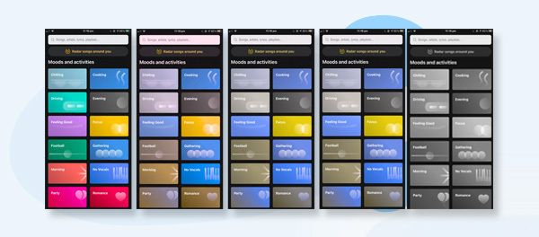
Moving on from Skeuomorphism which makes user interface objects in software mimic its real-world counterpart. Neumorphism uses semi-transparent background, with a sublime shadow and border.
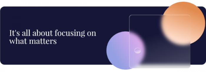
Used by companies such as Apple and Microsoft, glass morphism uses transparencies and a frosted glass effect. A multi-layered approach teamed with vivid colour and highlights, subtle light borders and translucent objects, gives the feeling of objects floating in space.
Traditionally seen in the tech space, this effect has gained widespread appeal in use cases from animated website banners and product advertising by pronouncing the object and shifting it to the forefront to grab attention.
This style does not come without its disadvantages though. The lack of contrast can be very hard to use for the visually impaired, should be used sparingly with clear object hierarchy, and for decorative purposes only.
Read our article on "How Your Outdated Website Can Affect Your Business"

With the revitalisation of art deco, a paradoxical trend of the old meeting the contemporary is showing up in the most unexpected of places. The tech startup.
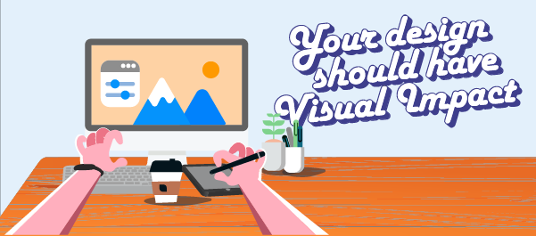
With a hat tip to the days gone by, the hand-drawn illustration obliterates language and harkens to a feeling of simpler days with a style that references a strong artisanal era, handcrafted beauty and design that has no language barriers. Incorporating simple bold colours, shading for 2d illustrations and simplicity for our ever reduced mobile screen size.
These images can convey instant messaging through iconography, are inclusive and authentic and bring an aesthetic and a humanistic approach to what can be a dry tech startup space.

Far from being boring, this trend is energizing the art world with bold striking designs using tone and colour to create contrasting imagery.
Made famous through the pop-art generation, Monochromatic and Duochrome designs are providing modern inspiration for design across many platforms.
Monochromatic design uses a single colour with variation only to the tone. Traditionally held to black and white, using colour monochrome colouring can bring exceptional feeling to single colour palates in graphic illustrations, logo design and dynamic imagery. Applying a monochromatic colour scheme can help strike the perfect balance between being interesting but not distracting.
Duotone design is experiencing more notoriety through the ubiquitous use of social image filters or the unique toning capacity they bring to life otherwise uninteresting images. Capitalising on this trend include uses cases for hero images, using the duo chromatic effect on background images creating an immediate contrast with a logo.
Colour Slices, traditionally the mainstay of corporate document design is breathing some fresh air into colourless monochromatic documents.
Duochromatic Splitting, the hybrid love child of slices, creates not only a metaphor of duality but can also create a simplistic yet bold tonal balance in an image.

Socially conscious design came about in the ’60s when design professionals sought to have greater influence in helping communities identify and solve problems. Socially conscious designers have built this idealistic methodology into things such as user experience, education and public health campaigns and information. The flow-on effect through to web design means more meaningful and impactful user experiences by considering accessibility, environmental factors, social and political systems.
Design is persuasive and reaches many audiences. There is no contesting the divisiveness that we are experiencing at this moment in time. Brand these days need to take a stand for something be it environmental, social or economic. Contemporary graphic design serves its purpose with integrity adopting these main tenets in brand design:
Here are some great ideas articles about socially responsible design
Graphic design can help your brand reflect your stance on social media, featuring positive imagery, in your logo through your website design.

There is a new creative energy in fonts. Rising from chaos and non-serif font trends of the past decade, the nostalgia vintage appeal of custom fonts is trending.
More than simply communicating an idea, great type can evoke emotion and help define a brand online.
A great example of this is the neo-retro font. They take a good dose of nostalgia to create a comforting feeling of a bygone era, using serif headlines, Type layering, smart gradients, outline fonts and hand-lettering all to create that nostalgic appeal.
Each year brings new challenges, new trends and new opportunities to transform your business. A brand and asset refresh is the perfect way to shed the old skin and make some noise. Now is the time to break out the megaphone.
If you’re ready to make an impact with design thought branding, web design, graphic design we’d love to hear from you.